Designing an eBook is more than just formatting text—it’s about crafting a seamless reading experience that works across devices, genres, and audiences. From typography and spacing to chapter structure and interactive navigation, every design choice shapes how readers engage with your content. Here’s a comprehensive guide that combines layout essentials with advanced formatting strategies to help you build a polished, professional eBook.
🔤 Choosing the Right Fonts for Digital Reading
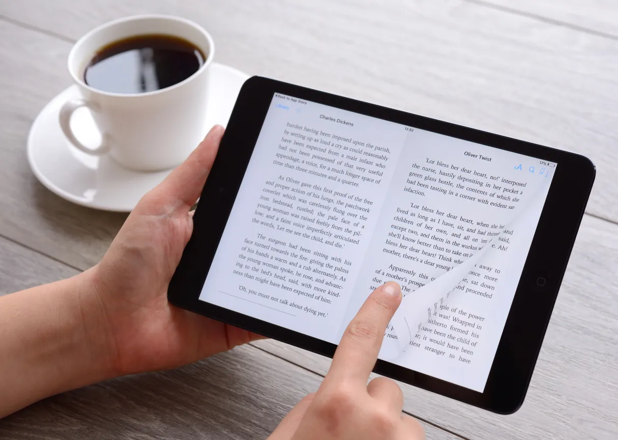
Typography sets the tone and affects readability. For eBooks, choose fonts that render well across screens and devices:
- Serif Fonts (great for long-form reading): Garamond, Georgia, Palatino
- Sans Serif Fonts (clean and modern): Arial, Helvetica, Roboto, Verdana
Avoid decorative or script fonts—they may look stylish but often display poorly on eReaders.
📏 Font Sizes That Work
- Body Text: 11–13 pt is ideal; 12 pt is the sweet spot for most genres
- Chapter Titles: 14–18 pt for clear hierarchy
- Subheadings: 12–14 pt depending on emphasis
Since eReaders allow font customization, your goal is to set a comfortable default that adapts well.
📐 Line Spacing & Margins
- Line Spacing: 1.2 to 1.5 for general readability
- Children’s or poetry books: Consider 1.5–2.0 for clarity and rhythm
- Margins: Around 1 inch to prevent cramped layouts
White space is your friend—it reduces eye strain and improves flow.
🧩 Chapter Structure & Navigation
- Start each chapter on a new page using Heading 1 styles or page breaks
- Use consistent formatting for titles (bold, centered, larger font)
- Add subheadings (Heading 2 or 3) to organize content within chapters
- Include short intros or quotes to set tone and context
Example: Chapter 5: The Digital Shift “Technology is best when it brings people together.” — Matt Mullenweg
📑 Table of Contents & Indexing
- Create a visual TOC at the beginning and a navigational TOC (NCX file or EPUB3
toc nav) for eReader compatibility - Use Heading styles to auto-generate entries
- For nonfiction or reference books, include an index with hyperlinked keywords—avoid page numbers since pagination is dynamic
Example: Index Artificial Intelligence →Chapter 4Behavioral Economics →Chapter 6
📄 Pagination in eBooks
- eBooks use dynamic pagination, which adjusts based on screen size and reader settings
- Instead of static page numbers, rely on chapter breaks and progress indicators like “Chapter 3 of 12”
- Avoid referencing page numbers from print editions—they won’t match
🧠 Pro Tips for a Seamless Layout
- Stick to 1–2 fonts for consistency
- Test your layout on multiple devices—what works on a tablet may feel cramped on a phone
- Use white space strategically to guide the eye
- Avoid manual formatting quirks that disrupt flow across platforms
- Include front matter (title page, copyright, dedication) and end matter (about the author, acknowledgments, references)
📘 Create your own book marketplace on: www.bookset.app
#eBookDesign #DigitalPublishing #TypographyTips #ReadabilityMatters #AuthorTools